How to add text to an image // Last week, I asked if anyone would be interested in learning more photo tips and tricks… You all answered with an astounding YES!! The number one question was… How do I add images to my text? With this Pinterest world we live in, knowing some basic graphic design really couldn't hurt, so I put together this meaty post to shed a little light on how to add text to your images. There's a lot to cover so I'm just going to jump right in…
Why Add Text to Images
When I'm beginning to craft a post, I think of it as pulling together a layout for a magazine article. I don't want it to look just like a blog post, I want it to catch the readers eye and pull them in. I want tickle their visual fancy along with providing some valuable information as well. Think about it… We eat and live with our eyes. If your images aren't appetizing, no one is going to partake of what you have to offer. With the explosion of Pinterest having visual appetizing images in your posts is even more important these days. You need to grab your readers with your best photo at the top of your post with a headline right on the images telling your reader exactly what that post is about. That means we all need to be not only photographer, writer, editor, creative director and now graphic designer on all of our work.
How to Add Text to Images with Photoshop Elements
Now you've realized the importance of adding text to your images, but how do you accomplish that? What program will you use? There are many different options at every price point. You can invest in Adobe Illustrator or Photoshop at the high end. Both amazing products that are super powerful, but with a high learning curve. You can go for the free option with online program like PicMonkey. They work alright, but are pretty basic. I tend to go with the middle of the road with Adobe Photoshop Elements. It's a very affordable program with many of the bells and whistles of Photoshop, but without the $700 Photoshop price tag. You can get Photoshop Elements for $100 so it's not too bad. Plus you are getting a pretty decent photo editor for beginning photographers.
I've made a video for you guys on how I add text to my photos using Photoshop Elements…
What Fonts to Use
Now, that you've learned how to add text and other design elements to your images, what fonts should you use? Your font choices are more important that you know. Using old and out of date fonts is like installing an avocado green toilet in your fancy newly remodeled cottage white bathroom. It's just a bad design idea. Pay attention to current trends. Remember, the way you style your photos are a big part of your brand. Take the time to make good font and design element selections.
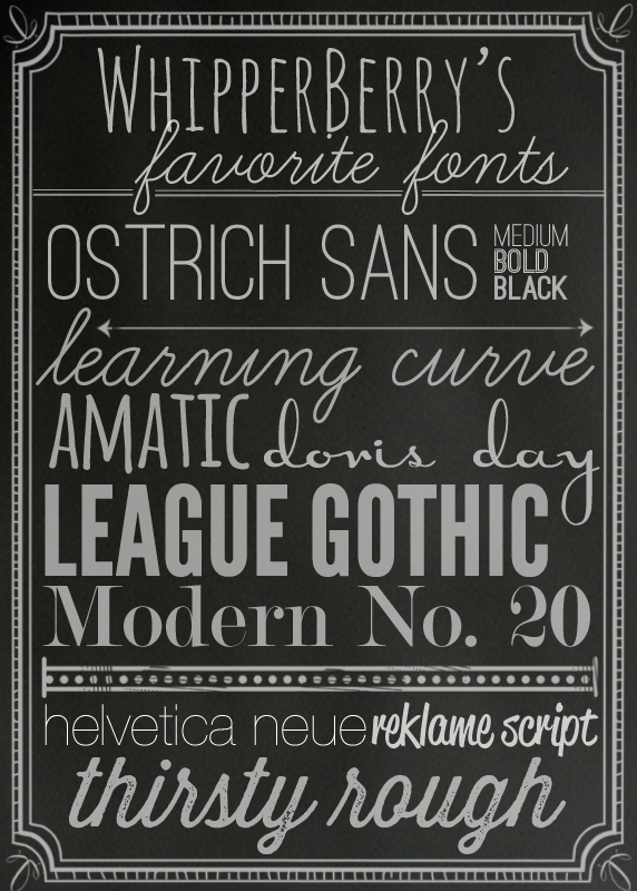
Here are a few of my favorite fonts right now. I tend to stay pretty simple and stick to just a few standard fonts. That way when people see my photos, they know… "that photo is from WhipperBerry."
ostrich sans // learning curve // amatic // doris day // league gothic // modern no.20 // helvetica neue ultra light // reklame script // thirsty rough
Most of these fonts are free. You can download a free demo of Reklame Script that can get you by, and Thirsty Rough is $5, not too bad.
Where to Find Good Brushes
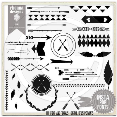
My go to gal for graphic elements is Rhonna Farrer the creator of Rhonna Designs. I have been a HUGE fan of her for some time. She has some amazing kits that you can purchase and then use to your hearts content. They come in a couple of different formats, so if brushes intimidate you, you can use the png format. Here is the kit that I used for this post… InstaPop!
Rhonna has a ton of fun kits, so you should go check them out.
There you have it… How I add text and graphics to my images. If you have any questions, let me know. I would be happy to help! Leave a comment or email me, heather (at) whipperberry (dot) com and I can see what I can do.
2


This is a fantastic post Heather!!! Thank you much for all of the great the tips!! ♥
I use PE as well, but I never realized that you could click with the text tool and drag a box to make a text box. I always have just clicked and typed. 🙂 THANK YOU! This is going to help so much.
Excellent post. Thank you!
Great tutorial! I was curious where you got the frame that is around your Favorite Fonts image? Is it a brush/stamp? Love it!
Thanks!
Sarah-
Good question! It is also a brush from Rhonna Designs InstaChalk kit.
kisses // heather
A really lovely tutorial, thanks for the tips! x
Ps How many emails fo you have? hehe It'd take me all week to get through those 😀
he he, yes I have an email issue! I need to hire someone to manage it for me. Thanks for your sweet comment.
kisses // heather
This post was so helpful! Thank you. I've had Photoshop Elements for about a year now and am still pretty intimidated by it. This will give me that little nudge I've been needing to try it again.
Thank you for this great post! It was fun to hear your voice after reading your words for so long.
What a fantastic post! So informative.
Thank you sooooo much for sharing! 🙂
LOVE this!!! thanks for sharing!!
This is awesome! Thank you! I've been trying to pick certain fonts to stick with for my blog. It's hard to pick sometimes!
Hi Heather! My blog I Heart Free Fonts is hosting a link-up of favorite fonts starting this Friday and I thought maybe you'd like to link up! Love your collection! https://iheartfreefonts.com/2013/05/06/free-fonts-linkup/
I highly recommend the online photo editor Fotor:
http://www.fotor.com
It’s worth to add in your list
Hey! I actually loved the font that says "favourite fonts" 😀 Can you tell me what is it called.. I am inlove with it :X
The font used for "favorite fonts" is Amatic. It's a google font, you can download it @ google.com/fonts – select "Choose" or "add to my collection" then download as a .zip.
I'm sorry it was learning curve…whipper berry's is Amatic. My bad! Though I think it may also be a google font..either way google fonts is a great source for fonts, especially for web and it provides you with the code to embed into your blog!