I have lost count of the times I finished a project, stepped back, and realized the paint was not the problem – the lettering was. A pantry label looked elegant on my laptop but became a gray blur after printing. A playful birthday banner felt more like a sale sign once every word was set in the same chunky font. And one vinyl quote required so much weeding that I quietly decided the wall looked lovely without it.
Fonts are materials, just like paper, paint, wood, ribbon, and vinyl. They have weight, texture, rhythm, and practical limits. The right one can make a homemade project feel intentional; the wrong one can make even careful craftsmanship look busy or hard to read.
My simplest advice is this: choose the font for the job first, the mood second, and the final size third. Then test it on the actual material and confirm that your license covers what you plan to make. I will walk you through the process I use for labels, signs, printables, party pieces, and occasional items made for clients or a small shop.
Start With the Job, Not the Font
A font menu is a terrible place to begin because every preview is trying to charm you. I start by writing one plain sentence: “This project needs to help someone ______.” A pantry label needs to help my family find the flour. A welcome sign needs to greet guests from several feet away. A printable treasure hunt needs to guide excited children who will not patiently decode decorative lettering.
Before browsing, answer four questions:
· Where will the words appear: wall, jar, invitation, screen, shirt, or packaging?
· How far away will the reader be?
· Is the text a short name, a headline, or a full set of instructions?
· Is this a personal project, a client project, a product for sale, or a public logo?
Those answers remove dozens of unsuitable choices. A delicate script can be wonderful for a three-word place card and exhausting for a recipe card. A condensed display face can make a tall porch sign feel polished but may squeeze pantry labels into narrow, hard-to-read stripes. Function is not the enemy of personality; it gives personality a place to work.
Turn the Mood Into Useful Design Words
“Cute” is not specific enough to guide a font choice. I ask my kids or a client for three adjectives and then translate those feelings into visible traits. Warm, handmade, and nostalgic might lead to a soft serif or a restrained script. Calm, tidy, and modern usually points toward an open sans serif. Loud, funny, and celebratory can handle a bold display face – especially when the message is short.
| Project mood | Good starting category | Works well for | Watch out for |
| Warm and classic | Serif | Welcome signs, recipe cards, family prints | Very thin strokes on rough wood |
| Clean and calm | Sans serif | Pantry labels, schedules, storage bins | A look that feels too clinical |
| Personal and celebratory | Script | Names, place cards, short gift tags | Long text and tight letter joins |
| Bold and playful | Display | Party banners, one-word labels, posters | Using it for every line |
A quote I keep taped near my desk says, “If everything is special, nothing is special.” I use the decorative font for the word that deserves attention, then let a quieter typeface do the supporting work.
Test Readability at the Real Size
The zoomed-in preview on a screen is generous. Paper, vinyl, paint, and distance are not. I print a quick draft at 100 percent, tape it where the finished piece will live, and walk away. For a jar label, I test it at arm’s length. For a wall sign, I cross the room. For a party invitation, I hand it to someone who did not design it and ask what they notice first.
Check the smallest letters, the counters – the enclosed spaces inside letters such as a, e, and p – and pairs that often close up, such as rn or cl. Also test numbers. A family calendar is not useful if 3 and 8 become twins.
For cutting machines, simplify further. Hairline strokes may tear, tiny enclosed spaces can lift, and elaborate swashes create frustrating weeding. I often add a little tracking, choose a sturdier weight, and enlarge punctuation. For wood signs, I account for grain and paint bleed. For home printing, I avoid ultra-light weights that may disappear on an ordinary inkjet.
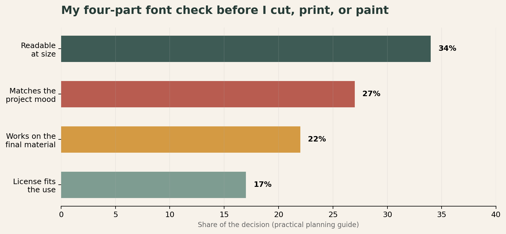
A planning guide, not research data: readability gets the largest share because it protects every other choice.
Pair Fonts Without Creating Visual Clutter
Most DIY projects need one font. A more layered printable or sign usually needs two. Three can work, but by then I want a clear reason for every voice in the room.
My reliable formula is one expressive face + one hardworking face. Try a serif headline with a clean sans-serif caption, or a script name with a simple sans-serif date. Contrast should be obvious. Two almost-matching sans serifs often look like a mistake, while a purposeful change in structure, weight, or width looks designed.
I also keep the roles consistent. If the sans serif is used for instructions on page one, it should not suddenly become the decorative headline on page two. Repeating roles creates a tiny design system – useful for pantry sets, chore charts, party suites, and matching gift tags.
A quick hierarchy recipe
· Headline: the strongest personality, largest size.
· Subhead: simpler, medium size, often semibold.
· Body or instructions: the clearest face, comfortable spacing.
· Tiny details: avoid scripts; use a sturdy regular or medium weight.
Match the Typeface to the Material
A typeface does not leave the project unchanged; the production method edits it. Vinyl rewards clean shapes. A paint pen introduces wobble. Kraft paper lowers contrast. Glossy labels reflect light. Fabric stretches. I make one small material sample before committing to a full set.
| Material / method | Choose | Avoid | Test |
| Adhesive vinyl | Open counters, medium or bold strokes | Hairlines and dense swashes | Weed one small word |
| Painted wood | Sturdy shapes and generous spacing | Tiny gaps that fill with paint | Stencil on scrap wood |
| Home-printed paper | Regular/medium weights, strong contrast | Ultra-light type on colored stock | Print at actual size |
| Fabric transfer | Simple silhouettes, wider spacing | Fragile details near seams | Wash a sample |
| Digital printable | Readable body text and clear hierarchy | Decorative fonts in instructions | View on phone and print |
One of my most common errors was choosing for the mockup rather than the object. I once used a lovely narrow serif on dark kraft labels. On screen it felt like an old apothecary; in the pantry it looked faint and cramped. Switching to a heavier weight and increasing the label width fixed the mood without sacrificing legibility.
Borrow a Lesson From Custom Brand Fonts
Even a small home project benefits from the same idea large brands use: lettering should support the experience, not simply decorate it. Domino’s worked on Dominos Sans Display and Dominos Sans Text, custom faces based on TT Commons™ Pro. The two-part system is a useful lesson for us: one voice can carry attention while another handles everyday reading across packaging, posters, and digital touchpoints.
Rocket offers another helpful example, especially for a home-centered blog. Its exclusive WNTL and Bowtie typefaces serve different emotional jobs within one identity. WNTL, a customized TT Commons™ Pro, brings an accessible contemporary tone; Bowtie adds a more classic voice. The point is not that a pantry needs a bespoke font. It is that consistency can still include contrast. A family command center can use one friendly display style for names and one highly readable style for dates and tasks.
Custom typography also solves problems that a ready-made font may not: distinctive letterforms, language coverage, technical performance, or a voice that competitors cannot copy exactly. For most DIY projects, a commercial family with several weights is plenty. If a project grows into a brand with packaging, an app, and a storefront, customization starts to make practical sense.
Understand Font Licensing Before You Share or Sell
A font file is creative software, not a jar of digital alphabet stickers. Buying or downloading it gives you specific usage rights; it does not automatically give you every right. I check the end-user license agreement before I send files to a client, upload editable templates, create a logo, or list finished goods for sale.
For a clear example of how uses are separated, TypeType offers distinct options that include desktop, logo, webfont, app, digital ads, video and broadcasting, eBook, publishing, server, trial, and custom licensing. The exact terms matter more than the category name, so read the current agreement for the font you choose.
| What you are making | License question to ask | Typical category to review |
| Printed sign, card, or flattened label art | How many computers need the font file? | Desktop |
| A public-facing logo | Does the license explicitly cover logo use? | Logo |
| Live text on a website | How are pageviews and duration counted? | Webfont |
| An editable app or template | Will the font be embedded or accessible to users? | App, server, or custom |
| A mockup used only to evaluate a font | Is commercial use excluded? | Trial |
Three rules save me trouble: do not pass the font file to a customer unless the agreement permits it; do not assume “free download” means free commercial use; and do not treat a trial font as a production license. If I deliver a flattened PDF or image, I still confirm that the license covers the underlying project and its distribution. When anything is unclear, I ask the foundry before publishing or selling.
Common Font Mistakes I Now Catch Early
· Choosing by alphabet preview alone. Type your real words, including names, numbers, punctuation, and awkward letter pairs.
· Using a script in all caps. Many scripts are designed to connect in lowercase and become tangled in capitals.
· Making every line bold. Without contrast, the reader cannot tell where to begin.
· Forgetting production loss. Thin details that look crisp on screen may vanish in paint, print, or vinyl.
· Stretching the type. Use a true condensed or extended family instead of dragging the text box sideways.
· Skipping the license. Check rights before client delivery, public logo use, web embedding, or resale.
My Final Project Checklist
· I can describe the job and audience in one sentence.
· The type mood matches three specific adjectives.
· The smallest text is readable at actual size and distance.
· Decorative lettering is limited to short, high-impact text.
· If I paired fonts, each one has a consistent role.
· I tested a sample on the final material or device.
· The license covers personal, client, commercial, logo, web, or embedded use as needed.
· I saved the source and a flattened delivery copy when appropriate.
The goal is not to make every project look professionally manufactured. I still want a handmade sign to feel like it came from my home and my hands. Good typography simply removes the distractions, so the color, message, memory, or gift can be the part people notice.
Frequently Asked Questions
How many fonts should I use in one DIY project?
Use one for a simple label or short sign. For a layered printable, two is usually enough: one expressive font for emphasis and one highly readable font for supporting text.
What fonts work best for cutting machines?
Choose medium or bold strokes, open counters, and limited swashes. Test-weeding a small word is more reliable than judging a large on-screen preview.
Can I use a free font on products I sell?
Only if its license allows commercial use for that product and distribution method. “Free” may mean personal use, trial use, or a limited license, so read the agreement.
Do I need a special license for a logo?
Possibly. Some foundries include logo use in a broader license; others sell a dedicated logo license. Check the specific font’s terms before the logo becomes public.
Should a printable use the same font everywhere?
Keep roles consistent, not necessarily identical. A decorative headline and a readable instruction face can feel cohesive when spacing, color, and hierarchy repeat across the set.
0
Leave a Reply