As a small business owner, I never thought I’d get a branding lesson from a pile of inner tubes—but here we are. On a recent family trip to a local water park, something caught my eye. Every single tube floating by had the same color scheme, logo placement, and style. They weren’t just flotation devices; they were part of the park’s brand story.
That’s when it clicked. These branded tubes were doing something so many small businesses struggle with: creating a consistent, recognizable visual identity that feels intentional from start to finish. Whether you’re running an online shop, a boutique service, or crafting your own products at home, there’s a lot we can learn from how water parks use these simple tools to make a big branding impact.
The Role of Branded Tubes in Water Park Visual Identity
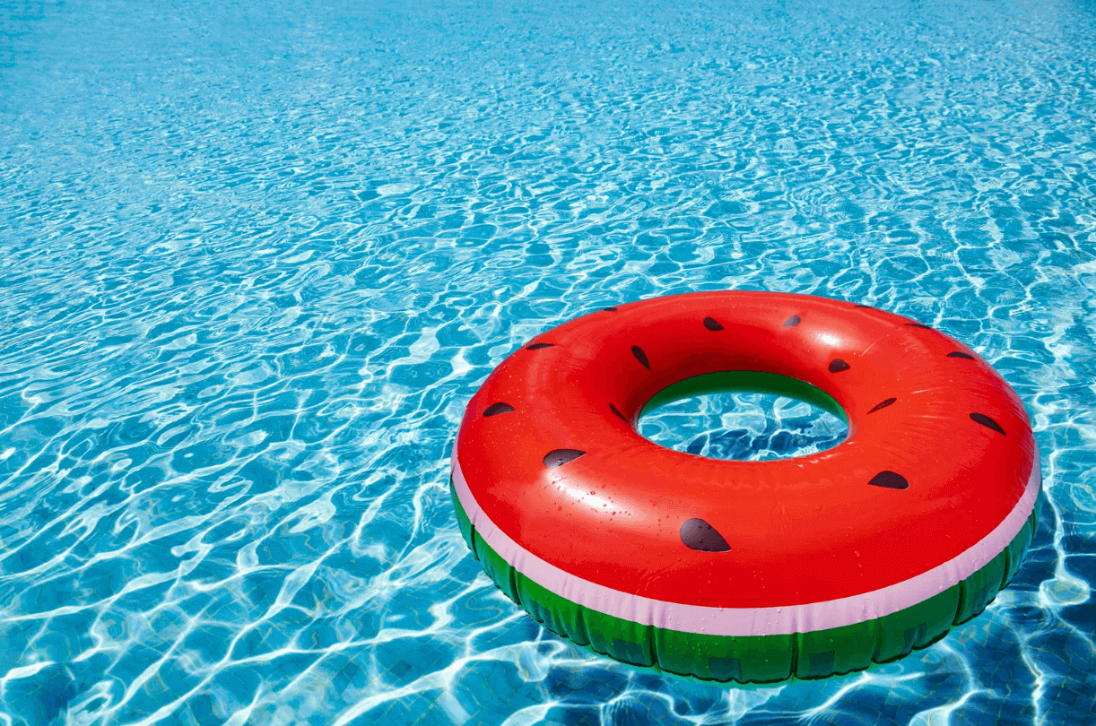
Branded tubes create a recognizable look that connects guests to a park’s image. They help unify the environment, reinforce brand colors, and make photos more shareable across social media. A clear design strategy for tubes supports both marketing goals and guest experience.

Creating a Cohesive Visual Identity Through Custom Tubes
Custom tubes act as moving brand elements across pools, rivers, and slides. Each design choice, like shape, size, and color, affects how visitors perceive the park’s personality. Parks that use custom designed river float tubes can display consistent visuals that match their overall theme.
A consistent look across all attractions helps guests associate the experience with a single identity. For example, matching colors on tubes, signage, and staff uniforms creates a unified atmosphere. This consistency strengthens recognition and builds trust among returning visitors.
Branded tubes also influence how guests capture and share their experiences. Photos featuring distinct designs circulate online, spreading awareness naturally. As a result, the park’s image becomes part of the visitor’s personal story, which supports word-of-mouth promotion.
Aligning Tube Design with Brand Message and Target Audience
The design of a water park tube should reflect the park’s tone and audience. A family-oriented park might use soft colors and friendly shapes, while a thrill-focused park could feature bold graphics and sharp contrasts. These design cues communicate the park’s message before guests even enter the water.
Understanding the audience allows designers to select patterns and materials that appeal directly to them. For example, durable double tubes may attract groups and families, while sleek single tubes suit solo riders. Aligning these details with brand values helps the park appear thoughtful and organized.
A well-planned design also supports marketing campaigns. Tubes that match advertisements or promotional visuals create a sense of continuity. This link between product and message reinforces the park’s story in a subtle but effective way.
Leveraging Logos, Typography, and Color Schemes for Maximum Impact
Logos, typography, and colors form the foundation of a park’s visual identity. Applying them consistently on tubes helps guests recognize the brand instantly. Large, clear logos placed on both sides of the tube keep the design visible in photos and videos.
Color selection matters as much as placement. Bright, distinctive shades stand out against water and sky, while muted tones may suit parks with a relaxed or natural theme. The goal is to make the brand visible without overwhelming the visual environment.
Typography also plays a key role. Simple, bold fonts are easier to read from a distance and hold up well in outdoor conditions. When all these elements work together, branded tubes become more than equipment; they become mobile symbols of the park’s identity.
Strengthening Brand Recognition and Customer Loyalty with Branded Tubes
Branded tubes in water parks serve as more than floatation devices. They act as visible brand assets that reinforce identity, shape perception, and influence how guests remember their experience. By focusing on visual details, emotional design, and consistent presentation, parks can build stronger recognition and long-term loyalty.
Improving Brand Perception and Emotional Connection
A branded tube can reflect a park’s personality through color, logo placement, and visual style. Bright, coordinated colors help guests associate the design with the park’s energy and atmosphere. For example, calm blues and greens can suggest relaxation, while bold reds and yellows can signal excitement.
Strong visual elements help create emotional ties. Guests often connect positive feelings, like fun, safety, and togetherness, with the brand they see most often during their visit. Therefore, a well-designed tube can serve as a reminder of those emotions long after guests leave.
Simple, clean graphic design also communicates professionalism and care. A consistent and appealing look across all tubes signals attention to detail, which improves brand perception and encourages trust. This visual consistency makes the brand easier to recall and strengthens recognition over time.
Maintaining Brand Consistency Across All Touchpoints
Consistency helps a brand appear organized and dependable. Every guest touchpoint, from signage to merchandise, should reflect the same logo, color palette, and imagery found on the tubes. This alignment reinforces recognition and prevents confusion.
For example, if a park uses turquoise and white on its tubes, those same colors should appear on staff uniforms and promotional materials. This repetition builds familiarity and helps guests identify the brand instantly.
A clear brand guide supports this process. It defines how each element should appear, which keeps the design uniform across departments. Consistent presentation across all surfaces, including water tubes, strengthens the park’s overall identity and helps maintain a cohesive brand image.
Driving Brand Experience and Customer Loyalty
Branded tubes influence the guest experience in ways that extend beyond appearance. A tube that looks appealing and feels safe contributes to a positive brand experience. Guests associate that comfort and enjoyment with the park itself, which can lead to repeat visits.
Memorable visual design also supports customer loyalty. Guests often take photos with branded tubes, share them online, and unintentionally promote the park through social media. This organic exposure increases brand recognition and creates a sense of community among visitors.
A strong emotional connection formed through consistent design and enjoyable experiences encourages guests to return. Over time, these repeated positive interactions turn casual visitors into loyal advocates who trust the brand and recommend it to others.
Conclusion
We might not be running theme parks, but we are running businesses that need to be memorable. The lesson from those water park tubes? Every touchpoint matters. From your packaging to your Instagram posts to the way your website feels, consistency builds trust—and trust brings people back.
So whether you’re printing stickers, designing product tags, or picking brand colors, take a page from the water park playbook. Make every piece of your brand float in the same direction. Because when your visual identity tells a clear, cohesive story, your customers won’t just remember you—they’ll come back for more.
0
Leave a Reply