Acrylic prints occupy a space that feels closer to industrial design than to conventional wall decor. A framed paper print can be elegant, but it still reads as a familiar format, one viewers know how to categorize at a glance. Acrylic changes that first impression because the image appears sealed beneath a smooth, reflective surface that gives it more weight and visual authority. The result is not merely a picture on a wall but an object with presence. That distinction matters in interiors where artwork is expected to do more than fill empty space. It needs to shape the mood of a room, hold attention, and suggest a point of view.
Photography benefits especially from that shift because photographs often depend on precision, clarity, and tonal control. A successful photograph can hinge on how light traces the edge of a face, how a skyline recedes into haze, or how contrast separates foreground from background. Acrylic amplifies those qualities by increasing apparent depth and making sharp details feel even more exact. Highlights seem cleaner, blacks appear denser, and colors often take on greater richness. Even a quiet image can feel more vivid when presented this way. That is one reason acrylic has become a favored format for people who want a photograph to look less like a reproduction and more like a finished visual statement.
There is also a practical dimension to the appeal. Acrylic prints often suit contemporary homes and offices because they feel streamlined and intentional, without requiring ornate framing or decorative accessories. Their polished finish pairs naturally with modern furniture, open walls, and interiors built around clean lines. At the same time, they can add sophistication to more traditional spaces by introducing contrast and a note of sleek restraint. This flexibility helps explain why acrylic continues to attract buyers across styles rather than remaining a niche presentation method. It offers a visual upgrade without demanding that the entire room be redesigned around it.
Why Surface Matters as Much as Subject
Most conversations about art begin with subject matter, but the surface carrying the image can be just as consequential. A misty landscape printed on matte paper tells one story, while the same scene under acrylic tells another. Surface influences how light interacts with an image, how the eye moves across it, and how long the viewer lingers. In that sense, presentation is not packaging added after the fact. It is part of the work’s meaning in the room. Acrylic makes this especially clear because it alters not only the appearance but also the emotional temperature of the piece.
The material’s glossy finish can intensify color and contrast, but its stronger effect is psychological. A surface that reflects light and appears almost glasslike signals polish, confidence, and permanence. That signal can make a bold abstract feel more assertive, a black and white portrait more cinematic, and a seascape more immersive. Viewers may not articulate those reactions in technical language, yet they register them immediately. The brain reads sheen, depth, and scale before it begins to analyze composition. Acrylic succeeds because it aligns those first impressions with the ambition of the image itself.
As buyers grow more attentive to how art is presented, the medium itself has become part of the decision, not just the image. That shift has opened space for retailers that treat print format as central to the viewing experience. Among them is iCanvas, a Chicago-based wall art company and online marketplace offering ready-to-hang pieces from independent artists, licensed estates, and cultural institutions in formats ranging from canvas and paper to metal, wood, and acrylic. For many buyers, acrylic has gained traction for its ability to heighten clarity, intensify color, and give photography or abstract work a more polished, substantial presence on the wall.
Photography Gains Depth, Clarity, and Drama
Photography is uniquely suited to acrylic because the medium rewards precision. Cameras capture minute differences in texture, light, and edge definition, but not every print format preserves those qualities with equal conviction. Acrylic tends to make fine details feel crisp and intentional, which can elevate everything from cityscapes to wildlife portraits. Architectural photography, in particular, often thrives in this format because clean lines and reflective surfaces are already central to the image. The medium reinforces what the photograph is trying to say. It tells the viewer that exactness is part of the beauty.

Landscape photography also gains from the sense of dimensionality acrylic can create. Mountains seem to recede farther, water looks more luminous, and skies acquire a subtle spaciousness that can make a room feel larger. This is not literal three-dimensionality, but a heightened illusion of depth produced by the interaction of image and glossy surface. Such effects are especially potent in photographs with strong natural light, dramatic horizons, or layered atmospheric perspective. A paper print can convey the same composition, of course, but acrylic often makes the image feel more immediate. It pulls the viewer toward the scene instead of simply presenting it.
Portraiture presents a different advantage. Faces under acrylic can appear strikingly vivid, with skin tones rendered in a way that feels rich yet controlled when the source file is strong. Black and white portraits can become especially commanding because the medium gives extra force to tonal separation and reflective highlights. That can add cinematic tension to a glance, a gesture, or a shadow line across the face. In commercial interiors, hospitality settings, and modern residences, that sense of drama is often precisely the point. The print is not meant merely to document a person or place. It is meant to establish an atmosphere.
Abstract Art Finds a Natural Partner in Acrylic
Abstract art often depends less on representation than on energy, rhythm, and visual force. The viewer responds to color fields, geometry, movement, and tension before searching for narrative. Acrylic supports that mode of looking because it sharpens the impact of those formal elements. Hard edges appear cleaner, layered color feels more saturated, and gestural compositions gain a polished finish that can make them seem freshly alive. A strong abstract does not ask permission to be noticed. Acrylic helps it claim the room quickly and persuasively.
This pairing is especially effective when the artwork relies on contrast. A composition built from black forms against white ground, or from vivid red cutting across cool neutrals, can feel more commanding when the surface intensifies the separation. The medium encourages a certain visual decisiveness. It gives abstraction a crispness that fits contemporary interiors where art is expected to provide punctuation rather than fade politely into the background. For collectors and casual buyers alike, that can make abstract work easier to place with confidence. The piece reads clearly from across the room and continues to reward attention at closer range.
There is also an interesting tension between spontaneity and finish. Many abstract works originate in expressive, improvised gestures that carry the energy of the artist’s hand. When those gestures are presented beneath a sleek acrylic surface, the result combines raw creativity with architectural polish. That balance can be especially appealing in homes and offices where people want art that feels intellectually current without appearing chaotic. Acrylic tempers disorder without sterilizing it. It gives expressive work a disciplined presentation, which often broadens its appeal beyond seasoned collectors to a wider design-conscious audience.
Bold Color Looks More Intentional Under Acrylic
Few mediums flatter bold color as directly as acrylic. Saturated blues, luminous oranges, deep greens, and high-voltage pinks tend to gain extra force beneath a glossy, light-responsive surface. This matters because strong color can easily tip into visual noise if the presentation lacks discipline. Acrylic gives it discipline by enclosing intensity within a clean, finished plane. The result can feel less like decorative exuberance and more like controlled impact. That distinction is crucial in rooms where color is being used strategically to energize the environment.
For interior designers, bold color often serves as a way to structure space. A vivid print can anchor a neutral room, echo accent furniture, or provide counterweight in an otherwise restrained palette. Acrylic is useful in that context because it helps the color read as deliberate and refined. Instead of looking like a casual splash, the artwork appears integrated into the design logic of the room. This can be especially effective in spaces with natural light, where the print changes character subtly over the course of the day. Morning light may emphasize brightness, while evening light can deepen the work’s tonal richness.
Bold color also has emotional consequences, and acrylic tends to heighten them. Warm tones can make a room feel more energetic and sociable, while cool saturated hues can create calm with an edge of sophistication. In both cases, the medium strengthens the emotional message by enhancing color presence without necessarily adding visual clutter. That is why acrylic prints often perform well in spaces meant to leave an impression quickly, such as entryways, conference rooms, dining areas, and hospitality settings. The artwork does not need a lengthy introduction. Its color does the talking, and acrylic makes sure that voice carries.
The Medium Works With Modern Interiors Because It Respects Space
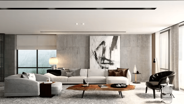
Acrylic prints suit modern interiors partly because they mirror the logic of modern design. Contemporary spaces often favor clarity, restraint, and a small number of strong choices over ornate layering. Acrylic aligns with that preference by offering a presentation that feels sleek, edited, and confident. It does not require heavy framing or decorative flourishes to appear complete. In many cases, that simplicity is the luxury. The image stands on its own, supported by a medium that looks substantial without becoming fussy.
This makes acrylic particularly effective in open-plan homes and offices where every visible object carries more visual responsibility. In a smaller room crowded with competing textures, subtle artwork can disappear. In a large room with high ceilings and limited adornment, weak presentation can feel unfinished. Acrylic solves part of that problem by allowing an image to hold its ground cleanly. The print can be large and assertive without seeming cumbersome. That combination of scale and lightness is one reason designers often turn to acrylic when they need a focal point that does not burden the architecture.
The medium also plays well with materials common in contemporary interiors, including glass, steel, concrete, lacquer, and light wood. Those surfaces all share a certain directness, and acrylic echoes it. Even in softer spaces with textiles and warmer palettes, an acrylic print can introduce welcome contrast. It can sharpen the room’s visual language without making the environment feel cold. That versatility matters because few people decorate according to a single doctrine. Most want spaces that feel layered, personal, and current, and acrylic has a way of fitting into that mix without looking forced.
Durability and Maintenance Add to the Appeal
Beauty alone rarely explains why one format outperforms another in the marketplace. Practical concerns matter, especially when art is being purchased for busy households, offices, rental properties, or public-facing interiors. Acrylic prints often appeal because they feel durable and easier to live with than more delicate alternatives. The rigid presentation suggests longevity from the start. Buyers tend to trust objects that appear solid, and acrylic projects that confidence before anyone reads a product description. In a category where presentation and practicality often pull in opposite directions, that matters.
Maintenance is part of the equation as well. A medium that looks polished but proves difficult to keep presentable can lose its charm quickly in real life. Acrylic’s smooth surface tends to support easier routine care than more textured formats that can trap dust or show wear differently over time. That makes it attractive for environments where artwork needs to remain crisp without constant fuss. It is also useful in high-traffic spaces where a refined look is expected but daily life refuses to pause. Consumers may buy on aesthetics, yet they often become loyal to a format because it fits ordinary use.
There is a business case here too. Hotels, offices, waiting rooms, and upscale retail settings often need art that reads as premium while standing up to public visibility. Acrylic answers that need by combining visual sharpness with a sense of professional finish. It looks expensive in a way that is legible even to people who know little about art. That immediate impression can be valuable in commercial spaces where artwork helps signal brand quality and attention to detail. In that sense, acrylic is not just a decorative choice. It is a strategic one.
Acrylic Prints Make Statement Art Easier to Live With
Statement art can be risky because what looks exciting in theory can feel overwhelming once it is on the wall. Acrylic helps manage that risk by giving strong images a controlled presentation. Whether the subject is a high-contrast photograph, an expansive abstract, or a composition built on saturated color, the medium supplies a clear visual framework. It tells the viewer that intensity has been organized. That can make ambitious artwork easier to incorporate into everyday spaces. The piece still commands attention, but it does so with composure.
This is especially important for buyers who want their walls to feel expressive without becoming chaotic. Acrylic offers a kind of visual editing. It strips away distractions, reduces the need for additional framing decisions, and gives even complex imagery a tidy perimeter. That clarity can encourage people to choose bolder work than they otherwise might. A collector uncertain about a vivid abstract or dramatic city photograph may feel more confident when the final presentation looks resolved from the outset. The medium, in effect, lowers the friction between taste and action.
That may be the strongest argument for acrylic’s broad appeal across photography, abstract art, and bold color. These are categories that thrive on immediacy, confidence, and visual conviction. Acrylic strengthens all three. It sharpens photographs, refines abstraction, and gives color more authority, while also fitting the practical and stylistic demands of contemporary interiors. In an era when consumers want art to be both expressive and livable, that combination is hard to ignore. Acrylic does not change the core image, but it changes how decisively the image enters a room, and that can make all the difference.
0
Leave a Reply