• Skip to primary navigation
  • Skip to main content
  • Skip to primary sidebar
  • Skip to footer

Whipperberry

WhipperBerry • Your Home For Creative Inspiration

  • Home
  • Recipes
    • Starters
    • Easy Weeknight Dinners
    • Main Dish
    • Salads
    • Side Dish
    • Soups & Stews
    • Desserts
    • Breakfast
    • Miscellaneous
  • Tutorials
    • Creative Crafts
    • DIY Decor
    • Fabric Crafts
    • Food How-To
    • Jewlery
    • Paint Projects
    • Paper Art
    • Party Styling
    • Photography and Graphic Design
    • Silhouette
  • Holidays
    • Easter
    • Mother’s Day
    • Father’s Day
    • 4th of July
    • Halloween
    • Thanksgiving
    • Christmas
    • Valentine’s Day
  • Gift Ideas
    • Gifts For Everyone
    • Gifts for Dad
    • Mother’s day
    • For The Girls
    • For The Kids
    • Teacher Gift Ideas
    • Christmas
  • Printables
    • Holiday
    • Gift Idea
    • LDS Primary
  • Travel
  • About
    • Terms
  • Contact
  • Nav Social Menu

    • Facebook
    • Instagram
    • Pinterest
    • RSS
    • Twitter

decor

Why Acrylic Prints Suit Photography, Abstract Art, and Bold Color

0 · Jul 13, 2026 · Leave a Comment

Acrylic prints occupy a space that feels closer to industrial design than to conventional wall decor. A framed paper print can be elegant, but it still reads as a familiar format, one viewers know how to categorize at a glance. Acrylic changes that first impression because the image appears sealed beneath a smooth, reflective surface that gives it more weight and visual authority. The result is not merely a picture on a wall but an object with presence. That distinction matters in interiors where artwork is expected to do more than fill empty space. It needs to shape the mood of a room, hold attention, and suggest a point of view.

Photography benefits especially from that shift because photographs often depend on precision, clarity, and tonal control. A successful photograph can hinge on how light traces the edge of a face, how a skyline recedes into haze, or how contrast separates foreground from background. Acrylic amplifies those qualities by increasing apparent depth and making sharp details feel even more exact. Highlights seem cleaner, blacks appear denser, and colors often take on greater richness. Even a quiet image can feel more vivid when presented this way. That is one reason acrylic has become a favored format for people who want a photograph to look less like a reproduction and more like a finished visual statement.

There is also a practical dimension to the appeal. Acrylic prints often suit contemporary homes and offices because they feel streamlined and intentional, without requiring ornate framing or decorative accessories. Their polished finish pairs naturally with modern furniture, open walls, and interiors built around clean lines. At the same time, they can add sophistication to more traditional spaces by introducing contrast and a note of sleek restraint. This flexibility helps explain why acrylic continues to attract buyers across styles rather than remaining a niche presentation method. It offers a visual upgrade without demanding that the entire room be redesigned around it.

Why Surface Matters as Much as Subject

Most conversations about art begin with subject matter, but the surface carrying the image can be just as consequential. A misty landscape printed on matte paper tells one story, while the same scene under acrylic tells another. Surface influences how light interacts with an image, how the eye moves across it, and how long the viewer lingers. In that sense, presentation is not packaging added after the fact. It is part of the work’s meaning in the room. Acrylic makes this especially clear because it alters not only the appearance but also the emotional temperature of the piece.

The material’s glossy finish can intensify color and contrast, but its stronger effect is psychological. A surface that reflects light and appears almost glasslike signals polish, confidence, and permanence. That signal can make a bold abstract feel more assertive, a black and white portrait more cinematic, and a seascape more immersive. Viewers may not articulate those reactions in technical language, yet they register them immediately. The brain reads sheen, depth, and scale before it begins to analyze composition. Acrylic succeeds because it aligns those first impressions with the ambition of the image itself.

As buyers grow more attentive to how art is presented, the medium itself has become part of the decision, not just the image. That shift has opened space for retailers that treat print format as central to the viewing experience. Among them is iCanvas, a Chicago-based wall art company and online marketplace offering ready-to-hang pieces from independent artists, licensed estates, and cultural institutions in formats ranging from canvas and paper to metal, wood, and acrylic. For many buyers, acrylic has gained traction for its ability to heighten clarity, intensify color, and give photography or abstract work a more polished, substantial presence on the wall.

Photography Gains Depth, Clarity, and Drama

Photography is uniquely suited to acrylic because the medium rewards precision. Cameras capture minute differences in texture, light, and edge definition, but not every print format preserves those qualities with equal conviction. Acrylic tends to make fine details feel crisp and intentional, which can elevate everything from cityscapes to wildlife portraits. Architectural photography, in particular, often thrives in this format because clean lines and reflective surfaces are already central to the image. The medium reinforces what the photograph is trying to say. It tells the viewer that exactness is part of the beauty.

Woman taking a picture with a camera

Landscape photography also gains from the sense of dimensionality acrylic can create. Mountains seem to recede farther, water looks more luminous, and skies acquire a subtle spaciousness that can make a room feel larger. This is not literal three-dimensionality, but a heightened illusion of depth produced by the interaction of image and glossy surface. Such effects are especially potent in photographs with strong natural light, dramatic horizons, or layered atmospheric perspective. A paper print can convey the same composition, of course, but acrylic often makes the image feel more immediate. It pulls the viewer toward the scene instead of simply presenting it.

Portraiture presents a different advantage. Faces under acrylic can appear strikingly vivid, with skin tones rendered in a way that feels rich yet controlled when the source file is strong. Black and white portraits can become especially commanding because the medium gives extra force to tonal separation and reflective highlights. That can add cinematic tension to a glance, a gesture, or a shadow line across the face. In commercial interiors, hospitality settings, and modern residences, that sense of drama is often precisely the point. The print is not meant merely to document a person or place. It is meant to establish an atmosphere.

Abstract Art Finds a Natural Partner in Acrylic

Abstract art often depends less on representation than on energy, rhythm, and visual force. The viewer responds to color fields, geometry, movement, and tension before searching for narrative. Acrylic supports that mode of looking because it sharpens the impact of those formal elements. Hard edges appear cleaner, layered color feels more saturated, and gestural compositions gain a polished finish that can make them seem freshly alive. A strong abstract does not ask permission to be noticed. Acrylic helps it claim the room quickly and persuasively.

This pairing is especially effective when the artwork relies on contrast. A composition built from black forms against white ground, or from vivid red cutting across cool neutrals, can feel more commanding when the surface intensifies the separation. The medium encourages a certain visual decisiveness. It gives abstraction a crispness that fits contemporary interiors where art is expected to provide punctuation rather than fade politely into the background. For collectors and casual buyers alike, that can make abstract work easier to place with confidence. The piece reads clearly from across the room and continues to reward attention at closer range.

There is also an interesting tension between spontaneity and finish. Many abstract works originate in expressive, improvised gestures that carry the energy of the artist’s hand. When those gestures are presented beneath a sleek acrylic surface, the result combines raw creativity with architectural polish. That balance can be especially appealing in homes and offices where people want art that feels intellectually current without appearing chaotic. Acrylic tempers disorder without sterilizing it. It gives expressive work a disciplined presentation, which often broadens its appeal beyond seasoned collectors to a wider design-conscious audience.

Bold Color Looks More Intentional Under Acrylic

Few mediums flatter bold color as directly as acrylic. Saturated blues, luminous oranges, deep greens, and high-voltage pinks tend to gain extra force beneath a glossy, light-responsive surface. This matters because strong color can easily tip into visual noise if the presentation lacks discipline. Acrylic gives it discipline by enclosing intensity within a clean, finished plane. The result can feel less like decorative exuberance and more like controlled impact. That distinction is crucial in rooms where color is being used strategically to energize the environment.

For interior designers, bold color often serves as a way to structure space. A vivid print can anchor a neutral room, echo accent furniture, or provide counterweight in an otherwise restrained palette. Acrylic is useful in that context because it helps the color read as deliberate and refined. Instead of looking like a casual splash, the artwork appears integrated into the design logic of the room. This can be especially effective in spaces with natural light, where the print changes character subtly over the course of the day. Morning light may emphasize brightness, while evening light can deepen the work’s tonal richness.

Bold color also has emotional consequences, and acrylic tends to heighten them. Warm tones can make a room feel more energetic and sociable, while cool saturated hues can create calm with an edge of sophistication. In both cases, the medium strengthens the emotional message by enhancing color presence without necessarily adding visual clutter. That is why acrylic prints often perform well in spaces meant to leave an impression quickly, such as entryways, conference rooms, dining areas, and hospitality settings. The artwork does not need a lengthy introduction. Its color does the talking, and acrylic makes sure that voice carries.

The Medium Works With Modern Interiors Because It Respects Space

Living room with furniture and an acrylic print abstract painting

Acrylic prints suit modern interiors partly because they mirror the logic of modern design. Contemporary spaces often favor clarity, restraint, and a small number of strong choices over ornate layering. Acrylic aligns with that preference by offering a presentation that feels sleek, edited, and confident. It does not require heavy framing or decorative flourishes to appear complete. In many cases, that simplicity is the luxury. The image stands on its own, supported by a medium that looks substantial without becoming fussy.

This makes acrylic particularly effective in open-plan homes and offices where every visible object carries more visual responsibility. In a smaller room crowded with competing textures, subtle artwork can disappear. In a large room with high ceilings and limited adornment, weak presentation can feel unfinished. Acrylic solves part of that problem by allowing an image to hold its ground cleanly. The print can be large and assertive without seeming cumbersome. That combination of scale and lightness is one reason designers often turn to acrylic when they need a focal point that does not burden the architecture.

The medium also plays well with materials common in contemporary interiors, including glass, steel, concrete, lacquer, and light wood. Those surfaces all share a certain directness, and acrylic echoes it. Even in softer spaces with textiles and warmer palettes, an acrylic print can introduce welcome contrast. It can sharpen the room’s visual language without making the environment feel cold. That versatility matters because few people decorate according to a single doctrine. Most want spaces that feel layered, personal, and current, and acrylic has a way of fitting into that mix without looking forced.

Durability and Maintenance Add to the Appeal

Beauty alone rarely explains why one format outperforms another in the marketplace. Practical concerns matter, especially when art is being purchased for busy households, offices, rental properties, or public-facing interiors. Acrylic prints often appeal because they feel durable and easier to live with than more delicate alternatives. The rigid presentation suggests longevity from the start. Buyers tend to trust objects that appear solid, and acrylic projects that confidence before anyone reads a product description. In a category where presentation and practicality often pull in opposite directions, that matters.

Maintenance is part of the equation as well. A medium that looks polished but proves difficult to keep presentable can lose its charm quickly in real life. Acrylic’s smooth surface tends to support easier routine care than more textured formats that can trap dust or show wear differently over time. That makes it attractive for environments where artwork needs to remain crisp without constant fuss. It is also useful in high-traffic spaces where a refined look is expected but daily life refuses to pause. Consumers may buy on aesthetics, yet they often become loyal to a format because it fits ordinary use.

There is a business case here too. Hotels, offices, waiting rooms, and upscale retail settings often need art that reads as premium while standing up to public visibility. Acrylic answers that need by combining visual sharpness with a sense of professional finish. It looks expensive in a way that is legible even to people who know little about art. That immediate impression can be valuable in commercial spaces where artwork helps signal brand quality and attention to detail. In that sense, acrylic is not just a decorative choice. It is a strategic one.

Acrylic Prints Make Statement Art Easier to Live With

Statement art can be risky because what looks exciting in theory can feel overwhelming once it is on the wall. Acrylic helps manage that risk by giving strong images a controlled presentation. Whether the subject is a high-contrast photograph, an expansive abstract, or a composition built on saturated color, the medium supplies a clear visual framework. It tells the viewer that intensity has been organized. That can make ambitious artwork easier to incorporate into everyday spaces. The piece still commands attention, but it does so with composure.

This is especially important for buyers who want their walls to feel expressive without becoming chaotic. Acrylic offers a kind of visual editing. It strips away distractions, reduces the need for additional framing decisions, and gives even complex imagery a tidy perimeter. That clarity can encourage people to choose bolder work than they otherwise might. A collector uncertain about a vivid abstract or dramatic city photograph may feel more confident when the final presentation looks resolved from the outset. The medium, in effect, lowers the friction between taste and action.

That may be the strongest argument for acrylic’s broad appeal across photography, abstract art, and bold color. These are categories that thrive on immediacy, confidence, and visual conviction. Acrylic strengthens all three. It sharpens photographs, refines abstraction, and gives color more authority, while also fitting the practical and stylistic demands of contemporary interiors. In an era when consumers want art to be both expressive and livable, that combination is hard to ignore. Acrylic does not change the core image, but it changes how decisively the image enters a room, and that can make all the difference.

Elegant Decor Ideas That Never Feel Overdone

0 · Jul 9, 2026 · Leave a Comment

Elegant decor does not need to feel formal, expensive or difficult to live with. In many homes, the most refined rooms are also the simplest ones. They have a clear point of view. The furniture fits the space. The colors work together. The decor feels intentional instead of crowded.

The key is restraint. A room can be warm, personal and stylish without being filled from wall to wall. When every piece has a purpose, the whole space feels calmer and more polished. These elegant decor ideas can help you create a home that looks finished without feeling overdone.

Start With a Clear Design Direction

Before buying new decor, decide how you want the room to feel. Calm and organic. Classic and tailored. Modern and minimal. Warm and traditional. A clear direction helps you avoid random purchases that do not work together.

This step matters because elegant rooms usually have a sense of order. That does not mean every piece must match. It means the colors, shapes and materials should relate to one another. A room with soft neutral walls, warm wood furniture and a sculptural fixture like the Lennox Branching Chandelier can feel refined because the main elements support the same design mood.

Start with two to four main colors. Warm whites, soft taupe, muted green, charcoal, navy and natural wood tones all work well in elegant interiors. Brushed brass, black metal or polished nickel can be used as accent finishes. Once your palette is set, it becomes easier to choose art, pillows, rugs and accessories.

Use Fewer Pieces With More Intention

One of the easiest ways to make a room feel more elegant is to remove a few things. Too many accessories can make even beautiful furniture feel lost. Editing gives each piece room to stand out.

Look at shelves, side tables, consoles and coffee tables. If every surface is full, the room may feel busy. Keep the items that add beauty, comfort or function. Store or donate the rest.

Negative space is part of good decorating. An empty section of a shelf or a clear stretch of wall is not wasted space. It gives the eye a place to rest. This is what makes a room feel composed instead of overstyled.

Invest in Timeless Foundation Pieces

Decor is easier to get right when the foundation of the room is strong. Furniture, rugs, window treatments and lighting carry more weight than small accessories. If these pieces look balanced, the room will already feel more refined.

Choose furniture with clean lines and good proportions. A simple sofa, a sturdy dining table or a well-shaped accent chair can last through many style changes. Avoid pieces that feel too trendy unless you truly love them.

A rug can also make a major difference. It anchors the room and connects the furniture. In a living room, the front legs of the sofa and chairs should usually sit on the rug. In a dining room, the rug should be large enough for chairs to move back without catching the edge.

Window treatments finish a room. Curtains hung close to the ceiling can make windows look taller. Roman shades can add softness without extra fabric. The goal is not drama. The goal is polish.

Layer Texture for Depth and Warmth

A simple room can still feel rich when it has texture. Texture keeps neutral spaces from looking flat. It also adds warmth without creating clutter.

Mix soft and structured materials. Linen curtains with a wood table. A wool rug with a leather chair. A ceramic vase beside a glass lamp. These quiet contrasts make the room more interesting.

Natural materials are especially useful in elegant decor. Wood, stone, cotton, wool, marble, clay and rattan all age well. They also bring an easy, grounded quality to a space. A room with natural texture often feels more comfortable than one filled with shiny or overly perfect finishes.

Choose Lighting That Feels Soft and Considered

Lighting affects how every room looks and feels. A space with only one bright ceiling light can feel harsh, even if the decor is beautiful. Elegant rooms usually use layers of light.

Use a mix of ambient, task and accent lighting. Ambient light comes from ceiling fixtures or recessed lighting. Task light comes from desk lamps, reading lamps or kitchen pendants. Accent light comes from sconces, picture lights or small lamps placed for mood.

Warm bulbs can make a room feel more inviting. Lamps placed at different heights help create depth. A well-chosen light fixture can also act like decor. It adds shape and style without needing extra accessories.

Decorate With Art in a Balanced Way

Art gives a room personality. It can also make a space feel more complete. The mistake many people make is choosing art that is too small for the wall.

Large walls need larger pieces or a group of frames that work together. Above a sofa, the art should usually take up a good portion of the wall space rather than floating in the middle. In smaller areas, one strong piece can be better than several tiny ones.

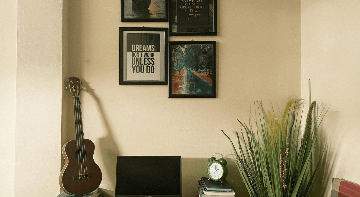
Gallery walls can look elegant when they are planned carefully. Use consistent spacing, related colors or similar frames. The pieces do not have to match exactly, but they should feel connected.

Style Shelves and Tables Without Clutter

Shelves and tables should look curated, not crowded. Use a mix of books, bowls, vases, trays, lamps and sculptural objects. Vary the height and shape so the arrangement feels natural.

Small groupings usually work best. Try two or three items together, such as a stack of books, a small vase and a bowl. On a coffee table, a tray can help contain smaller pieces and make the surface look organized.

Do not feel the need to fill every shelf. A few well-placed objects often look more elegant than a full display.

Add Greenery and Florals With Restraint

Plants and flowers bring life to a room. They soften hard lines and add color in a natural way. Still, restraint matters.

One statement arrangement can be enough. A vase of branches on an entry table, a simple orchid on a console or fresh greenery on a dining table can add interest without taking over the space.

Tall plants can also help fill empty corners. An olive tree, fiddle leaf fig or simple potted plant adds height and movement. Choose planters that match the room’s style so the look stays cohesive.

Use Mirrors to Add Light and Space

Mirrors can make rooms feel brighter and larger when used thoughtfully. Place them across from windows, near lamps or along open sightlines to reflect light.

The frame should match the mood of the room. A slim metal frame feels modern. A wood frame feels warm. An antique finish can add character. Avoid using too many mirrors in one space, as that can feel distracting.

Keep Personal Items Edited and Meaningful

Elegant decor should not feel cold. Personal objects make a home feel lived in. The key is to display them with care.

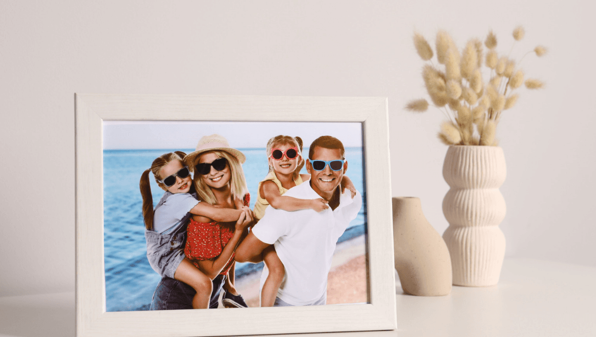
Choose a few meaningful items instead of showing everything at once. Family photos look cleaner in matching frames. Travel pieces can be grouped on one shelf. An heirloom can become a quiet focal point when it has enough space around it.

This approach keeps the room personal without making it feel cluttered.

Pay Attention to Proportion and Scale

Scale is one of the most important parts of elegant decorating. Tiny decor on a large console can look weak. A small rug in a large living room can make the furniture feel disconnected.

Use fewer, larger pieces when styling big surfaces. A wide bowl, a tall vase or a pair of lamps can feel more balanced than many small accessories. Make sure furniture fits the room and leaves enough space to move comfortably.

Final Thoughts

Elegant decor is not about perfection. It is about balance, comfort and intention. A room feels refined when the colors work together, the lighting feels soft and the decor has room to breathe.

Before adding more, edit what you already have. Choose pieces that support the room. Keep surfaces calm. Use texture, art, greenery and lighting to build interest.

The best elegant interiors are beautiful but still easy to live in. They feel thoughtful without feeling staged. That is what keeps them from ever looking overdone.

Travel-inspired Home Decor: How Flowers, Colors, and Local Traditions Can Bring Your Favorite Trip Back Home

0 · Jun 29, 2026 · Leave a Comment

Whether it was a family vacation, a girls’ getaway, or a once-in-a-lifetime adventure, travel has a way of leaving a lasting impression. The challenge comes after you’re back home, when everyday routines of school drop-offs, meal planning, laundry, and work slowly replace those unforgettable moments.

Instead of letting those memories fade, why not weave them into the place your family spends the most time: your home? Small touches like fresh flowers, meaningful colors, and traditions inspired by places you’ve visited can turn everyday spaces into reminders of the experiences that shaped you.

If Colombia is one of those special places, flower delivery to Colombia can keep the color of a Medellín market connected to the people, rituals, and rooms that made the journey matter. The colors of a Medellín flower market, the particular blue of an Aegean doorway, the smell of jasmine in a Marrakech riad – it all begins fading behind the routine of groceries, laundry, and Monday morning alarms.

But here’s what I’ve noticed: the travelers who hold onto that feeling the longest aren’t the ones with the most photos. They’re the ones who’ve woven pieces of their journeys into the spaces they actually live in. Not through generic souvenirs collecting dust on a shelf – through deliberate choices about flowers, color, texture, and ritual that transform a room into a quiet reminder of somewhere extraordinary.

This goes deeper than pinning a map on the wall. It’s about understanding why certain places made you feel alive and recreating those sensory triggers at home. Let’s break down how to do that without turning your apartment into a theme park.

Flowers as Travel Souvenir

Why Flowers Are The Most Underrated Travel Souvenir

Most travel-decor articles jump straight to textiles and vintage suitcases. They completely skip over something that cultures around the world have used for centuries to define their spaces: flowers.

Think about it. Marigolds in a Oaxacan home aren’t decoration – they’re a bridge between worlds during Día de los Muertos. Orchids on a Thai spirit house carry meaning no throw pillow can replicate. Lotus arrangements in a Vietnamese home signal something about purity and renewal that the family lives with daily.

When you bring region-specific blooms into your own home, you’re doing more than adding color. You’re importing a tiny ecosystem of meaning. And unlike a ceramic plate, flowers change – they open, they scent a room, they remind you that beauty is temporary, which is sort of the whole lesson of travel anyway.

Picking Blooms That Tell a Specific Story

Here’s a practical approach I’ve found useful:

  • Colombia: Roses, carnations, and exotic orchids. Colombia is the second-largest flower exporter in the world, and its blooms are tied to everything from Medellín’s Feria de las Flores to everyday market culture. If you fell in love with the floral traditions of Colombia, keeping fresh Colombian-grown stems in your home is one of the most direct ways to hold onto that experience.
  • Japan: Cherry blossom branches (or realistic faux versions) in a simple ceramic vessel evoke ikebana’s principle of “less is the whole point.”
  • Morocco: Orange blossom and jasmine – even in essential-oil form diffused near a tray of mint tea glasses – can reconstruct the sensory atmosphere of a riad courtyard.
  • Provence: Dried lavender bundles. Straightforward, long-lasting, and they still smell like July in Gordes three months later.
  • India: Tuberose and marigold garlands. String them along a doorway for a festival-day feeling.

The key is specificity. Don’t just grab “flowers.” Choose the exact species connected to the place you’re remembering. That specificity is what triggers the memory.

Borrowing Color Palettes From Places, Not Pinterest

Every destination has a chromatic fingerprint – a combination of colors that exists nowhere else on earth in quite the same proportion. The problem is, most people come home and try to recall those colors from memory. Memory lies. It exaggerates sunsets and desaturates everything else.

Here’s a better method: pull up your travel photos and use a free color-palette generator (Coolors and Adobe Color both work) to extract the actual hex values from your images. You’ll be surprised. That “vibrant turquoise” door in Havana? It’s probably closer to a muted teal. The “bright white” of Santorini has gray-blue undertones you didn’t consciously notice.

A Color Framework By Region

Some starting points, based on recurring palettes I’ve observed across dozens of interiors:

  • Latin America (Colombia, Mexico, Guatemala): Saturated yellows, deep terracotta, cobalt blue, papaya orange. These cultures aren’t afraid of color clashing – the clash is the harmony. Try painting one accent wall in a bold Colombian gold and pairing it with hand-painted ceramics.
  • Scandinavia: Warm whites, pale wood tones, muted sage, charcoal. The trick here is texture over color – think boucle, unfinished pine, and candlelight.
  • Southeast Asia: Emerald green, saffron, dark teak, gold leaf accents. Dense and layered, like walking through a temple.
  • Mediterranean: Whitewash, faded blue, olive green, dried-herb brown. Restraint with warmth.

Pro tip: you don’t need to repaint your whole house. A set of throw pillow covers, a ceramic vase, or even a single piece of wall art in the right palette can shift the entire emotional temperature of a room.

Local Traditions That Actually Translate To Home Rituals

This is the piece competitors almost always miss. Travel-inspired decor isn’t just visual. The most powerful way to bring a trip home is to adopt a small daily practice rooted in the culture you experienced.

Some examples that work in a typical American household:

  • The Danish concept of hygge: A dedicated “cozy corner” with a thick blanket, a warm-light lamp, and a candle. No screens allowed. This isn’t decorating – it’s redesigning how you use a space.
  • The Japanese genkan: A transitional zone at your front door where shoes come off and the outside world stays outside. Even a small bench, a shoe tray, and a single ikebana arrangement can create this threshold.
  • The Colombian flower tradition: In many Colombian homes, fresh flowers on the table aren’t reserved for special occasions – they’re a weekly constant. Adopting this practice keeps your home feeling alive and connected to a culture that treats flowers as an essential, not a luxury. Start with roses, carnations, or orchids in colors that echo the market stalls you remember.
  • The Moroccan tea ritual: A brass tray, small glasses, fresh mint, and green tea. Set it on a low table. Use it on Sundays. The objects become the decor, and the practice becomes the memory anchor.

These rituals accomplish something a gallery wall simply can’t: they engage your body and your senses, not just your eyes. When you pour tea from a Moroccan pot every weekend, your muscles remember the riad. That’s deeper than decoration.

How To Avoid the “Souvenir Shop” Effect

There’s a fine line between a home that tells travel stories and one that looks like it swallowed an airport gift shop. The difference usually comes down to three principles:

  1. Edit ruthlessly. One handwoven textile draped over a chair back says more than twelve items crammed on a bookshelf. Give each piece room to breathe.
  2. Mix eras and origins with intention. A Balinese wood carving next to a mid-century modern lamp works if they share a visual quality – warmth, simplicity, organic lines. It fails when neither connects to anything else in the room.
  3. Anchor with living elements. Fresh flowers, potted plants from climate-similar regions, and natural materials (rattan, clay, raw linen) prevent a space from feeling like a museum. They signal that someone actually lives here, among these memories.

One interior designer I spoke with put it perfectly: “The goal isn’t to recreate Bali in Brooklyn. It’s to capture the feeling of a slower morning in Ubud and engineer it into your Tuesday.”

Putting It All Together – Room by Room

Entryway

Set the tone immediately. A small bench (Japanese genkan-style), a potted fern, and a woven basket for keys sourced from your last trip. This says: a traveler lives here.

Living Room

This is where your color palette and textiles do their heaviest lifting. Choose one region’s palette as your foundation, then layer in pieces from other trips as accents. A Colombian-inspired arrangement of roses and exotic greenery on the coffee table can serve as the room’s living centerpiece – more impactful than any print on the wall.

Kitchen or Dining Area

Ceramics, spice jars, and the ritual objects – your Moroccan tea set, your Portuguese tile trivet, your hand-thrown bowls from a pottery village in Oaxaca. These items earn their place by being used, not displayed.

Travel-inspired Home Decor

Bedroom

Keep it calm. A single scent (lavender, sandalwood, whatever unlocks a specific memory), one textile, muted tones. The bedroom isn’t for stimulation – it’s for the quiet, contented feeling you had on the best night of your trip.

Your Home As A Living Travel Journal

The best travel-inspired homes I’ve seen don’t look “themed.” They look layered – accumulated over years, evolving with each trip, mixing handmade ceramics from Portugal with farmer’s-market flowers from down the street. What ties it all together is intentionality.

Start small. Choose one trip that changed how you see the world. Identify the colors, scents, flowers, and daily rhythms that defined it. Then bring one or two of those elements home – not as trophies, but as living pieces of a life shaped by curiosity.

If a particular region’s floral culture caught your attention – say, Colombia’s extraordinary tradition of growing and gifting flowers as part of everyday life – keep that memory present through a weekly vase, a market-inspired palette, or a small ritual you repeat at home.

Because the point of travel was never to leave and come back unchanged. It was to bring something back that makes even an ordinary Tuesday feel a little more like that perfect afternoon abroad.

After all, the best vacations don’t just leave us with photos. They inspire the way we live, gather, and create a home where every room tells a story.

Change Your Photos, Not Your Walls: 5 Flexible Decor Ideas for Families

0 · Mar 20, 2026 · Leave a Comment

We’ve all been there. It’s your living room, and you see the big, empty wall screaming for some family photos. You’ve got a bunch of amazing photos and a hammer in your hand to make the first hole.

For some reason, however, you can’t seem to do it. You are nervous about getting the nails in the wrong spots. You are paralyzed by the thought of the gallery wall being crooked. You fear you will want to change it again next year after you do a new family portrait session.

You have just found yourself in the world of decor paralysis. Most busy moms and renters want to keep their security deposits, and the idea of so many permanent holes in their pristine drywall is a real fear.

The anxiety of committing to a wall arrangement can leave photos of children, pets, and vacations stuck in the phone, forever.With flexible decor, there is no need to choose between empty walls and drywall riddled with holes.

Seasonal rotational display methods keep homes feeling new and facilitate showcasing recent memories, all without the need to make permanent nail and hammer decisions. These are five decor ideas that allow families to easily change decor.

decor ideas

1. Embrace Removable Photo Tiles

When instant home decor gratification is needed, removable photo tiles are a game changer. These photo blocks with a lightweight adhesive back can stick to your drywall without damaging it, and can be pressed on and pulled off an unlimited number of times.

With the ability to easily update decor seasonally, and for families living in rentals where no nails can be used, this is the ideal solution. It takes less than ten minutes to make an evenly spaced grid in your hallway. If one is unexpectedly too high, it can be peeled and stuck back on.

They provide a fantastic modern look. The sleek edges allow your walls to look clean without the bulk of traditional wooden frames. If you want to learn about the brand visual for your art and photography online and want to keep your design cohesive with your space, integrating your wallpics with your brand or family aesthetic will work seamlessly. It will take the stress out of interior design.

2. Design a Clip-and-Cable Display

For a more rustic, laid-back look clip-and-cable displays work great. This technique uses a length of twine, a slim metal wire, or a cord and crosses a section of wall. Then mini clothespins or metal clips can be used to secure a few of your favorite prints.

This is a great option for imperfect, everyday photographs. If you got a funny, candid picture of your child with spaghetti, clip it up! If your oldest child painted a great watercolor and it came home from school, clip it right up! It will make your wall a living scrapbook of the daily family life and will make it look alive.

You only require two tiny anchor points for hanging the wire, and you do not even need to level separate frames to get the look you are going for. If you are interested in how flexible displays can help narrate your family’s story at home and help with your personal brand, visit the guides for artists and photographers to shine online. Adopting these ideas for displays is not only about enhancing the aesthetic appeal of your space, but it also makes your most cherished memories shareable, and accessible, from anywhere. It’s also quick to update. With the display, you are free to change the prints frequently. Simply unclip the photos for the memories you would like to replace, and clip in the new ones whenever you get new 4×6 photos printed.

Read More: https://www.wallpics.com/blogs/news/boosting-your-brands-visibility-with-youtube-a-guide-for-artists-and-photographers

3. Create a Magnetic Photo Board

For more dynamic areas, such as a child’s play space or a home office, an excellent option is to use magnetic photo boards. Instead of hanging pictures separately, you can create a large, decorative magnetic board as a whole. After this, the space will act as your canvas.Consider using decorative magnets to overlap pictures and create a display that resembles a mood board. This display style creates unique texture and visual excitement to a room and increases interactivity and engagement from children. Each month you can consider a small family project of selecting pictures to add to the display board of family vacations or family pets.

Magnetic boards can range from shiny stainless steel to rustic galvanized metals. There are options that are covered in fabric making the back of the board invisible. These boards are great because you can match them to your furniture while keeping your photos from any thumbtack holes or sticky tape stains.

4. Install Picture Ledge Shelving

If you are fond of the style of ornate and heavy picture frames and complex gallery walls picture ledges are perfect for you. Picture ledges are designed to hold frames and have a small front lip that keeps the frames from sliding off the front.

If you add one or two long ledges in your living room, you will create a permanent stage for a revolving cast of characters. You can arrange some of your framed photos of different sizes against the wall, overlapping them for a casual but professional style. When autumn comes, you can change your bright summer beach photos for warm, autumn family portraits.

You can get picture ledges to add some narrative to your display. This works for those who want a home that reflects their changing family and their creative spirit. In addition to your framed images, you could place a small trailing plant, a favorite hardback book, or a little wooden sign for some extra character. This style reflects how artists and art buyers track interest over time, gauging popularity based on what is loved. Each time you change or add something to your photo ledge, you get a living, quantifiable expression of your family’s style.

Read Also: https://www.wallpics.com/blogs/news/measuring-success-key-email-marketing-metrics-for-artists-and-art-sellers

5. Blend in Digital Gallery Frames

Flexible decor is probably best exemplified by the major breakthroughs in the world of digital frames. Gone are the days of bulky digital frames with low-res displays. Today’s digital gallery frames are smart, high-grade products that look like matted photographs and feature anti-glare technology and high-end wood or metal bezels.

Imagine mixing a large digital frame into your gallery wall. It can offer limitless creative rotation, as you can upload thousands of images to it directly from your phone via Wi-Fi. You can schedule it to change images every few hours, or you can set it to show one stunning family portrait all week.

This is an optimum solution for the thousands of photos we take that may never be printed. By placing a high-end digital frame in a picture ledge or as the focal point of your changeable decor, you finally use all of the photos that live on your device, rather than the thousands of images you never printed. It alleviates all of the guilt of leaving those marvelous photos in the cloud where they’re virtually inaccessible.

framed photos

3 Quick Photography Tips for a Cohesive Look

Changing the photos on your display is great, but frequent changes can make your display look messy. Here are a few tips to make your gallery look cohesive:

1. Go Completely Black and White

If your photos are colorful and have different lighting and background, you can put on a black and white filter to make your photos look cohesive. Black and white photos are classic and elegant. Most galleries have black and white to add a level of sophistication.

2. Chase the Natural Light

Whenever you are taking photos indoors, try to make sure your family is positioned so that they are in front of a window, especially if they are taking photos in the day. Photos taken in daylight look so much better than photos taken with indoors. Daylight photos look better and of higher quality.

3. Use Consistent White Space

If you are using digital mosaic tiles or thing of a grid display picture, try to have photos with a lot of white space in them, (like a shot of your children at the beach). A wide shot is a good balance to a tight shot and to prevent the wall from looking heavy.

Bring Your Walls to Life

Decorating a home can be a stressful undertaking, but it doesn’t have to be! You can create a beautiful and personal space without needing a level set of power tools, or a degree in interior design. Stress-relieving strategies give you the flexibility to change your space however and whenever you want. Some examples include clip-and-cable systems, pretty removable tiles, and stylish picture ledges.

As your family changes and grows, and as you make new memories, your home decor should be able to do the same. So put the hammer and the power tool down. The time has come to open your phone and stick stunning photos on your walls!

  • Page 1
  • Page 2
  • Page 3
  • Interim pages omitted …
  • Page 9
  • Go to Next Page »

Primary Sidebar

Heather from Whipperberry
Hello... my name is Heather and I'm the creator of WhipperBerry a creative lifestyle blog packed full of great recipes and creative ideas for your home and family. I find I am happiest when I'm living a creative life and I love to share what I've been up to along the way... Come explore, my hope is that you'll leave inspired!

Footer

  • Privacy Policy
  • Crafts
  • Food
  • Gifts
  • Holidays
  • Home
  • Mom Life
  • Recipes
  • Travel

Copyright © 2026 · Seasoned Pro